Showing posts with label home tour. Show all posts

Thursday, 24 July 2014

Donna Wilson's creative home

Donna Wilson has to be one of my all-time favourite designers. Not only does she create some of the happiest textile designs around, she also helps bring good design to the the lives of others. Her recent project at the Royal London Hospital, for example, involved painting lush green murals on the walls of the children's ward for the patients to enjoy, and she is now currently working with Aberdeen residents to design a unique tartan for the Scottish county.

This creative spirit is also carried through into the designer's home where Donna mixes bold colours and clashing patterns and vintage furniture with modern accessories.

Below are a few of my highlights from her home, including a dining room filled with vintage Ercol - swoon! Head over to The Telegraph to see the full tour.

[Images: Rachael Smith via The Telegraph]

Monday, 7 January 2013

A Compact London Flat

Hi all, happy Monday! Today I want to share with you a beautifully decorated London flat which proves that you don't need a large space to have a beautiful home. This compact space has been given an airy feel using lots of white and soft greys, with hints of neon pink to keep it fun. It's possibly one of my favourite homes I've featured on High Street Home so I hope you like it! My favourite piece in the flat has to be the Ercol 203 Windsor Armchair which has been modernised with a mid-grey fabric - a great piece that mixes old with new.
What do you think? I love everything about this space from the neutral colour scheme to the vintage touches and bright pink accents. And that kitchen is EXACTLY what my future kitchen will look like!

{Images: The Guardian}

Monday, 5 November 2012

A Dreamy Dutch Home

When it comes to interiors, Scandinavia often do it best - airy homes with white washed walls, the perfect backdrop to colourful art and textiles. This is certainly true of the beautiful home of Netherlands-based interior designer Sonia van der Zwaan-Barrigas, which I stumbled across this weekend. I love the mix of design-classics (Eames and Muuto to name a few) with high street pieces (the cushions are from H&M and there's some Ikea in there too), which creates a personal, unique home. What do you think?


My favourite room in the house has to be the bedroom - I love the grey wall and that sweet girl print.

{Images: Houzz}

Monday, 15 October 2012

A Bright and Cheery Swedish Home

Hi guys, happy Monday! I want to start the week off on a bright and cheery note so I've featured a lovely Swedish home, complete with lots of yellow accents. A nice antidote to the dull, grey skies outside!
I absolutely LOVE the yellow tiled splashback in the kitchen - what a great way to add pattern and colour to the room. I stumbled across this pretty house tour on the Hus and Hem website which has lots of lovely home tours and room ideas, so if you've got an hour to spare have a peek!

{Images: Hus & Hem}

Monday, 20 August 2012

Inspiring Interiors: Beautiful Blues

Hi  guys, happy Monday! What are you up to today? I'm currently sat indoors hiding away from the blistering heat we have here in Germany today (32 degrees!), it's just way too warm for me and my pale freckled skin! Therefore I'm spending my afternoon doing a bit of blogging and a bit of baking, yay!

The first post on High Street Home this week is a house tour of designer Fiona Douglas' home. Fiona is the founder of Scottish textile brand Bluebellgray who specialise in printed floral textiles. Her own work is on display in her home as well as lots of blue tones, Fiona's favourite colour.
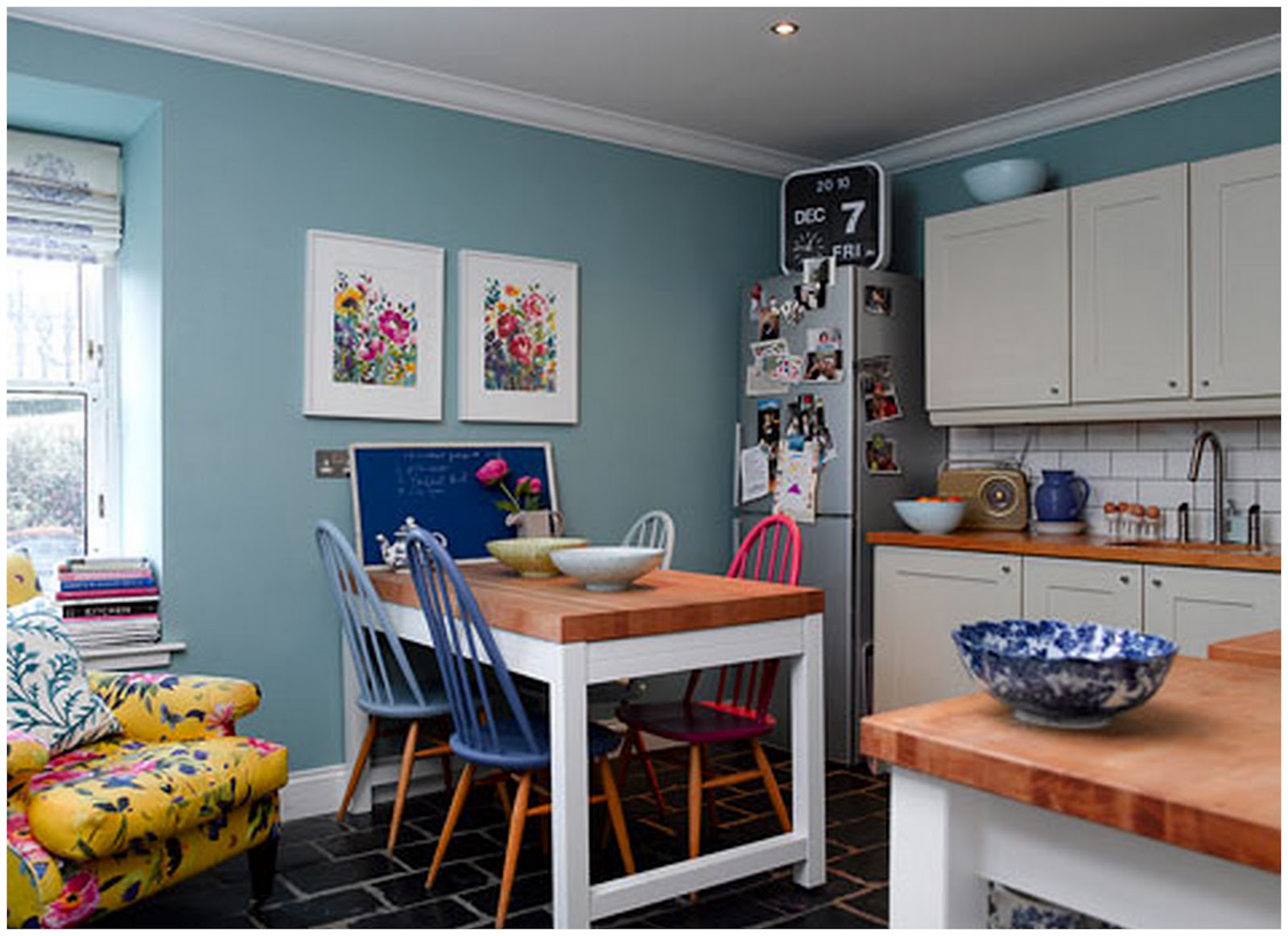
I absolutely LOVE Fiona's kitchen. The pops of colour from the chairs and artwork work so well against the aqua walls.
Fiona has painted the names of her favourite shades of blue on the stairs which I think is a great idea. A lovely focal point with a personal touch.
A colourful comfy armchair adds a cosy element to the kitchen area.
The bedroom colour scheme has been paired down slightly with the addition of plain white walls, though there are still lots of colourful accessories dotted around.
I'm not usually a fan of the colour blue but Fiona has used the colour really really well. I love how there is a lot of colour around but the space still looks really elegant and grown up. What do you think?
Most of the floral designs in these images (light shades, cushions, upholstery) are by Fiona's company Bluebellgray so if you like them head over to her website.

{Images: David Cadzow}

Monday, 8 August 2011

Sibella Court's China Town Apartment

Hi guys, how was your weekend? Mine was spent watching repeats of The Antiques Road Trip (great show) and eating in the tiny Hand and Heart restaurant in Nottingham, so was lovely all round! What did you get up to?
I thought I would start the week with a particularly lovely house tour from New York. This gorgeous little apartment is home to stylist Sibella Court and is located in central China Town. The loft apartment was converted from an old textile workshop and the tin ceiling and metal pipes have been kept as a reminder of this. Sibella has also referenced the immediate area in which she lives with lots of Chinese paper lanterns clustered together. Lets have a nosy around.
I particularly like (and am slightly jealous of!) her vintage collection of butterflies above her chest of draws. She has so many and has displayed them beautifully.
The predominant colours throughout the apartment are white and green which provide a cool, airy feel. Sibella has teemed antique green feature pieces (chest of draws, vintage wallpaper) with plain white walls which help make features of the accent pieces rather than distract from them.
The apartment is a treasure chest of well curated pieces. I love the freshness of the plain white walls and exposed pipework mixed with lots of antique pieces. There are a lot of things on display but somehow it still doesn't look cluttered.
Overall a beautiful, creative space which has given me lots of ideas for my own place. If you want to find out more about Sibella, have a look at her website for her Australian store, The Society Inc, a truly creative project. Sibella has also published two books: Etcetera and The Stylist's Guide to NYC, both are certainly worth a read.

{All images: House to Home}

Thursday, 9 June 2011

Amy Butler's Stylish Ohio Home

If you missed Apartment Therapy's House Tour of designer Amy Butler's home, you missed a real treat. Her home, which she shares with husband David, is such a creative space. It's full of Amy's electric prints, with lots of wood and soothing white walls. It's a hub of activity but still manages to create a sense of tranquillity and calm. For those of you that did miss it, you can see the full tour here. Alternatively, just scroll down for my edited version. I've picked the best photographs from the tour which, for me, really capture this creative pad. All photography is by David Butler.

Let's start with the entrance...
Amy sees gardening as "as much of a passion" for her as her print-work, and this can certainly be seen from the outside of her home. There's lots of colour in the trees and plants surrounding the doorway, and they are perfectly placed to frame the entrance. The huge open doorway merges the outside with the inside and the white ceiling in the hallway works well creating a light, airy feeling.

Moving into the sitting room/ lounge area...
In the main sitting area, Amy has papered her walls in her own design, Lacework, from Graham & Brown and has mixed vintage and modern furniture. In the close-up shot of her dresser you can see her vintage trinkets all sat together, creating a wonderful display that is both personal and pretty to look at. I LOVE the boxed butterfly, I've been looking for one of those for my own home for ages now!

Next up is her easy-going kitchen and dining area...
Amy says her kitchen was one of her biggest indulgences. She has two refrigerators, two ovens, two dishwashers and an ice machine, so that the space would be perfect for entertaining. Although the kitchen is appliance-heavy and functional, she has maintained a pretty exterior- a hard task when there are lots of gadgets around. Don't you just love the simplicity of the large wooden dining table! Right next to those patio doors too, swoon.

So far we haven't seen too much of Amy's textiles and prints, but these come into play in the bedrooms and chill-out zones, which you can see below.
The floral cushions and artwork in the chill-out area complement the turquoise feature wall so perfectly. What a beautiful room. And the fun, colourful printed textiles in the bedroom really add a burst of energy to the pared-down neutral colour scheme.

I really love how this house works as a creative workroom for the couple (Amy and David's studios are in the basement) as well as it being a relaxed space. There are elements of Amy's work dotted around the house, as in the photographs below, but it is so clutter-free and relaxing at the same time.
A big thanks are due to Amy for sharing her beautiful space with us. Thank you, what an inspirational place you have! I've blogged before about how much I love Amy's work, so to see the inside of her house was a real treat for me. I hope it was for you too, and you've been inspired as much as I have!

{All images: David Butler via Apartment Therapy}

Tuesday, 17 May 2011

Hilda Grahnat's Swedish Home

Today I want to share with you some inspiring photographs of Hilda Grahnat's beautiful home in Malmö, Sweden. Hilda, who took these lovely photos herself, is a 24 year-old photographer, blogger, artisan and graphic design student based in Sweden. Her home is a mixture of thrift store finds, vintage pieces and handmade objects. Get ready to be inspired.
Beautiful, don't you think? Hilda has this amazing ability to display objects, she makes ordinary things seem beautiful and interesting. Ornaments, books, and her quirky collection of clocks are all displayed in such an artful, aesthetically pleasing way. I also love how she has used the natural light to enhance her rooms and things in them.
The same bright, colourful style is used continuously throughout her home, from the bold globe in the sitting room, to the brightly coloured bread bins in the kitchen. Very retro, but modern at the same time. Below are some close-ups showcasing her inventive and playful storage ideas. I absolutely LOVE her coat-hanger 'wardrobe' for her glasses. Such a fun idea!
So many beautiful photographs! If you want to see more of Hilda's home, please go to her Flickr page where there are hundreds of lovely photos!
Hilda also makes pretty clocks out of vintage books (you can see one of these displayed on her bookshelf above) which you can buy via her blog. Here is a selection of my favourites:
Very retro. As well as these vintage clocks, Hilda also sells one-off prints and tote bags, have a look at her shop here.


{All Images: Hilda Grahnat}
Related Posts Plugin for WordPress, Blogger...